
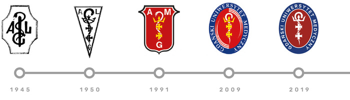
Tradition and the preservation of elements from previous marks, combined with a refreshed form adapted to current trends in visual communication, are the defining features of the new logo of the Medical University of Gdańsk.

University visual identity
In 2019 the University introduced a new, coherent visual identity system. This is one of the elements of the University Strategy for 2019-2025. It is also a response to the needs expressed by the academic community, which requires professional tools to actively promote the University.
The introduced mark is a refreshed version of the logo used since 2009, created by Sylwia Scisłowska, an artist who has for many years been associated with the Department of Anatomy and Neurobiology at the MUG.
Promotional and informational materials have been designed according to a unified aesthetic approach, ensuring their consistency and recognisability. Each material defines the colour scheme, typefaces, appropriate placement and legibility of the mark. When used together, these materials form one coherent whole.

Corporate Identity Book
The brand book presents the rules that must be followed when presenting the logo of the Medical University of Gdańsk on various media, business cards and letterheads, and multimedia presentations, as well as the permitted colour palette and typography.

Logo usage manual
The MUG logo may be used in all publications and documents related to the implementation of the MUG's statutory tasks, initiatives organised or co-organised by University units, the student government, doctoral student government or student organisations operating at the University.